A Chart is a graphical representation of data and is an effective way to communicate information effectively and visually. Building the right visualisation can help the audience to identify trends, patterns, relationships, and outliers.
Open the Dashboard where you want to add a new chart. Click on the Dashboard Menu and select Edit
Click on the Basic Chart Selector and drag the New Chart block onto the dashboard
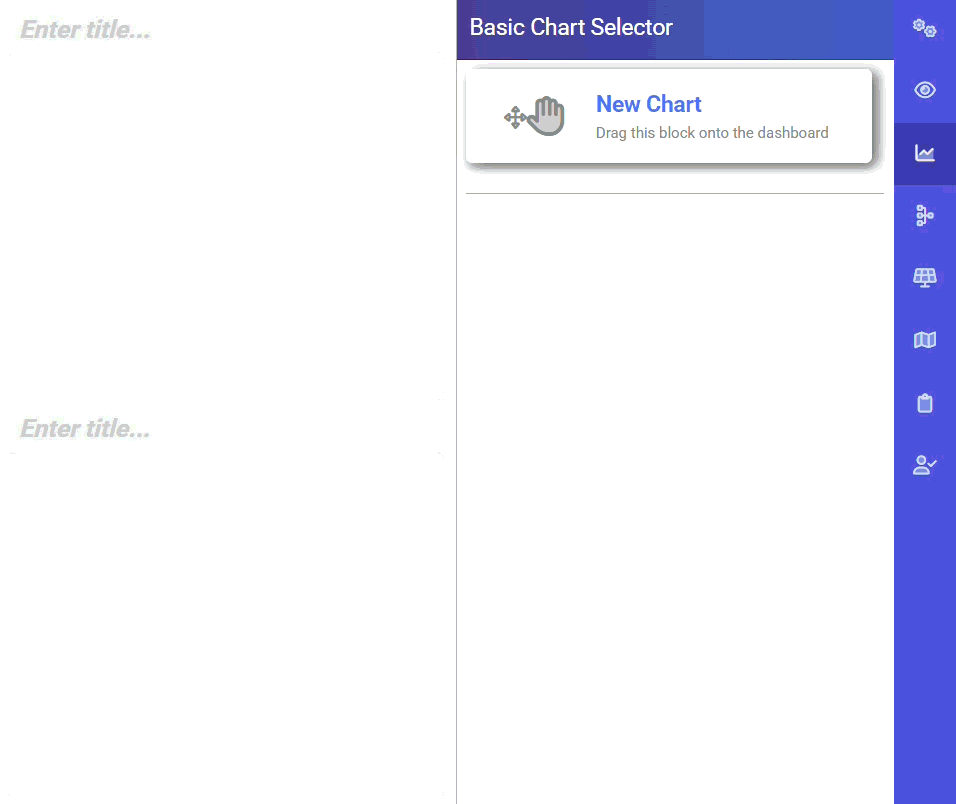
This will open the Chart Settings where you can configure the chart to display the data
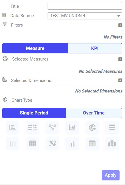
This is a free text field. You can manually add a Title to your chart, or you can leave this to automatically generate after you have selected the chart measures and dimensions.
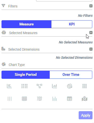
Depending on the data you are presenting, there may be a need to apply a Chart Filter. For example, you may wish to only display data in the chart for a particular region, salesperson, customer or product.
To do this, click on the + button next to Filters. Select the dimension and the category for the areas of interest.
You can select more than one filter dimension
There is a variety of Measures that you can present in your chart and configure to your requirements. For example, you can display an average duration of a process, volume of workload, or sum of invoices.
To do this, click on the Measure button and then the + sign. From the drop-down, select the measure and the function.
You can select more than one measure to be displayed on the same chart.
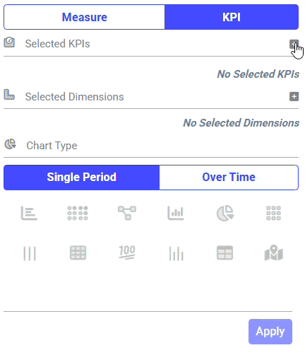
You can use the chart to display KPIs from your KPI Bank.
To do this, click on the KPI button and then the + sign. Select the KPI from the drop down. You can add more than one KPI.
For more information on KPI, refer to the KPI guide.
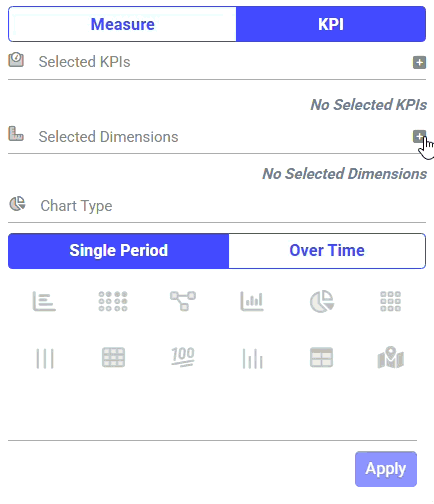
Dimensions determine how the data in a chart is grouped and help illustrate breakdown of the measure into specific categories. This helps to focus visually on different groups of data.
To do this, click on the + sign next to Dimensions and from the drop down, select the dimension. You can use up to two dimensions in a chart.
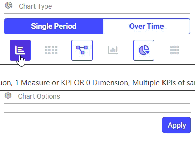
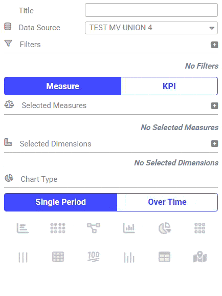
There are different chart types available and are categorised under Single Period or Over Time.
Depending on the number of Measures/KPI and Dimensions you have selected, the available Chart Types will be shown as Dark Blue.
You can hover the mouse over the chart types to give you more information and what is required for the chart type to be available for you to select.
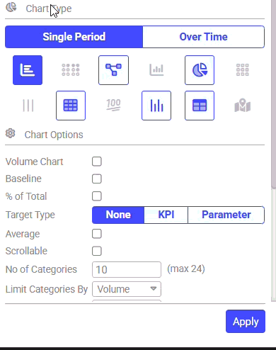
Once you have selected the desired chart type, various chart options will be available to further tailor the visual.