A bird's-eye view of what's important to you. Easily create dynamic and interactive dashboards to communicate insights and display data with easy-to-understand visuals.
Filter and access deeper layers with a single click.
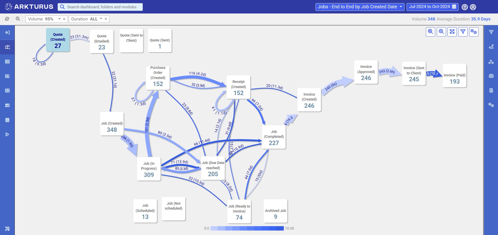
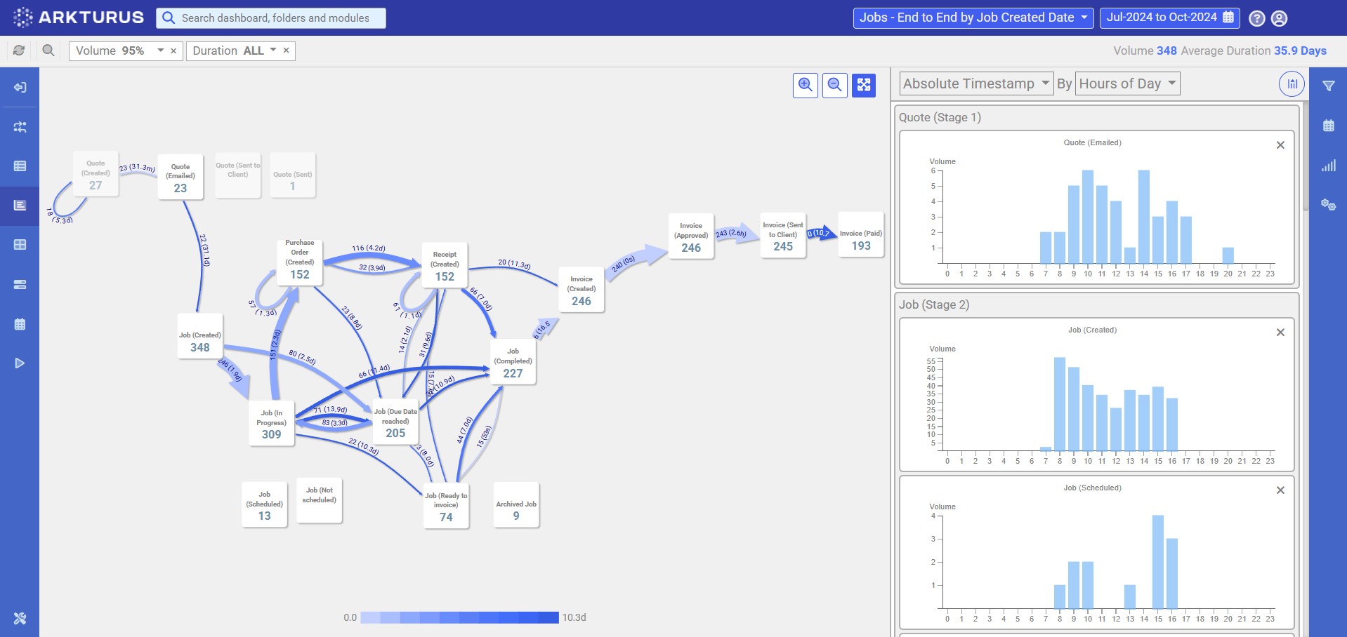
The Arkturus Process Visualiser, or ProViz, is an invaluable tool that enables you to interact with your process data visually and from a new vantage point, surfacing efficiently, insights previously undiscovered.
This layer sits one click behind your dashboards, providing immediate end-to-end awareness of what's working well, and what isn't, i.e. bottlenecks, rework and more.
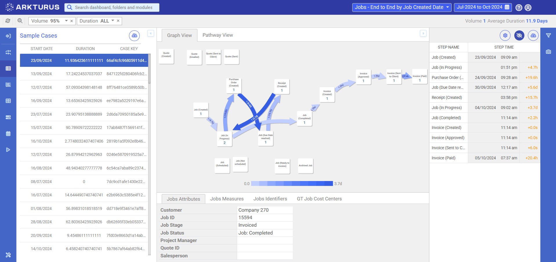
Our third interactive data layer is the Case Viewer.
Retain filters from ProViz or Dashboards and narrow your process data, to view key details on individual cases and their surrounding insights such as delays, duplications and other inefficiencies.
Use Event Analysis to easily visualise and analyse the time of events.
This functionality allows you to look at when events are taking place and how they are spread across the day to identify busy times of the day and how it impacts the next subsequent steps.
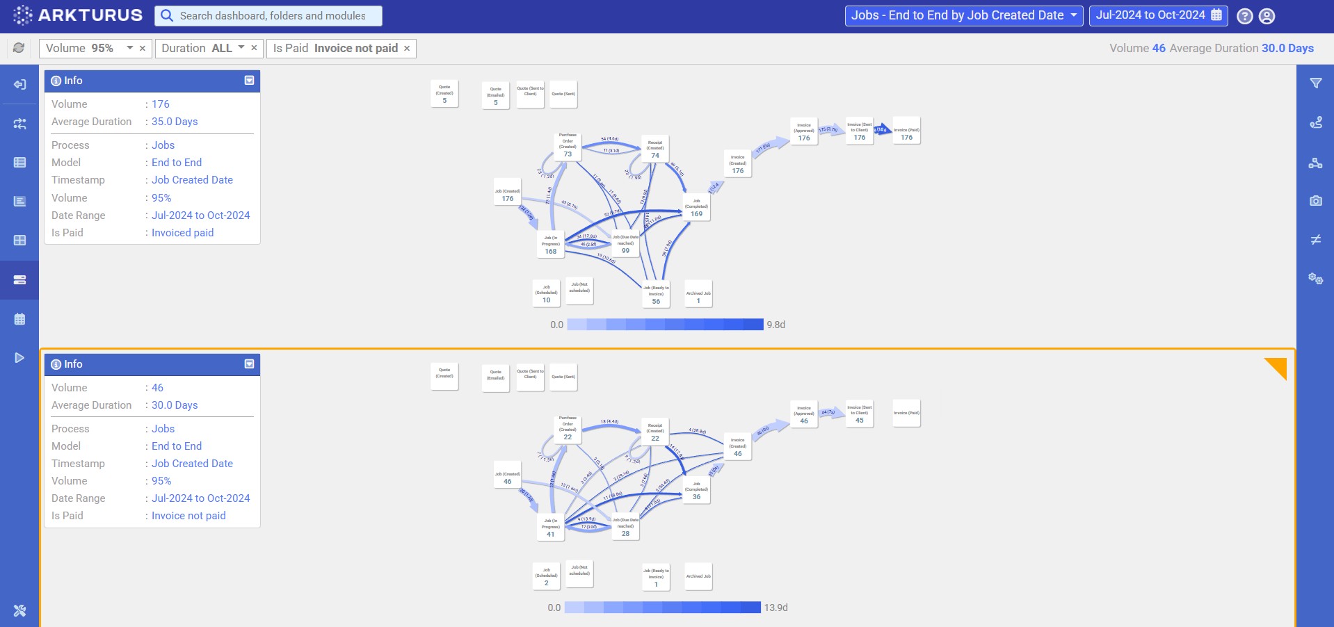
The Compare Graphs feature allows users to compare processes with different parameters, i.e. branches, departments, products and dates.
The side-by-side display of the process, mapped with different parameters, enables you to spot similarities and differences.